The Dangers of Public Emails and Phone Numbers


Screen Shot 2017-09-06 at 8.43.09 PM.png

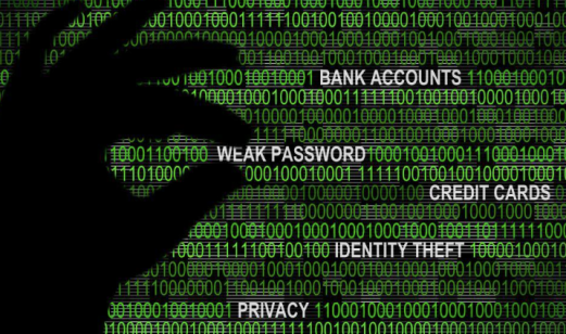
The present world we live in is dominated by live feeds, social media updates, tagged locations, and online information forums.  It seems like second nature to constantly share information about oneself.  In fact, it might even seem strange not to engage in the constant sharing of personal (and sometimes unnecessary) updates and information.  Privacy is slowly beginning  to fade as we begin to favor transparency.  We live in a society that desperately wants to be available, noticed, and contacted. A growing number of the population does not give a second thought to posting their emails or phone numbers on public profiles and sites.  An example of this would be a college student posting their resume on an open job board.  Now, let’s stop and think about what information is on a resume; a full name, email address, phone number, home address, and a complete listing of all previous employers and education.  This is an extremely personal list of information that now can be accessed by anyone who just so happens to come across the job board.  This being said, what are the dangers and threats to consider when personal contact information such as email addresses and phone numbers are public?

One of the obvious consequences to posting personal contact information online would be an increased chance of receiving more spam in your email inbox.  You might also receive more calls from solicitors.  But, this is more of an annoyance than a danger.  So, the question is, “Where are the real dangers?”


Screen Shot 2017-09-06 at 8.44.01 PM.png


When your email or phone number is shared publicly online, it becomes a portal for scammers and hackers.  Something as simple as your email address actually gives away a substantial amount of information regarding a person.  For example, numbers used in an email address could easily reference dates or years personal to the user.  Letters or words in emails could reference initials, family names, identifying facts, or locations that can be used to gather and link together other personal information about a person.  Posting phone numbers publicly online offers personal information such as location and name.  When all of these little piece of information are linked together, one becomes an easier target for scammers to use to their advantage.

Having an email or phone number that is public increases a risk of online abuse and threatening messages.  This decreases the well-being of the owner of the phone number and email address.  The owner of the phone number or email address can become a victim of manipulation.  It is easier to be tricked into giving out or verifying personal facts or information.

When one shares their email or phone number publicly with a certain company, one runs the risk of having personal information leaked.  Their privacy may become compromised as well as the information provided that was intended to remain confidential.


Screen Shot 2017-09-06 at 8.50.01 PM.png

Overall, when you post personal contact information such as your email address or phone number, you are chipping away your privacy and safety.  There needs to be more awareness regarding privacy and public access to personal information on the internet.


Screen Shot 2017-09-06 at 8.45.04 PM.png


Snapshot 369

Screen Shot 2017-04-20 at 7.13.20 PM.png

This is the real estate advertisement I created for a house in my hometown of Greenwich, Connecticut.  I choose to create this type of real estate advertisement a certain way for several reasons.  The first reason is that I come from a town that is stereotyped into being wealthy.  Everyone who meets me and learns of where I’m from always asks, “Are you rich?” or “Do you live in a mansion.”  While I am not wealthy and do not live in a mansion the town is still know for it’s wealth. I chose the caption “This can all be yours….” paired with a beautiful mansion with because this is the type of ideology in the culture of my town.  If you want a giant house and have a ton of money, you should live here.  If you would like. a ton of money and would like a big house, live here too.  I specifically chose this picture because this is the type of house someone might see if they looked at a real estate ad.  They would see long driveways, huge houses, and lush yards.  I was attempting to convey the culture and ideology of the town while creating a message that would attract the type of people my town would attract.

Screen Shot 2017-04-20 at 7.20.05 PM.png

This is the real estate advertisement I created for a home in Sweden.  I chose this image for my real estate advertisement because all of the houses are similar and close together.  However, all of the houses have small unique factors in them.  I liked this picture because Sweden has a very strong sense of community.  Sweden utilizes an individualistic culture, but Sweden also has a lot of connections with each other within their culture.  They are all one similar community with similar desires and beliefs made up of individuals.  I thought this picture of the houses would emulate this.  I used the caption “Join our community,” just to reinforce the concept.  I used the dark maroon/ brown color for the caption because I wanted the color to match the color scheme of the picture and even blend in with it a little bit.  I wanted to do this to promote the idea of immersing yourself into a community.

Something I really attempted to do was put myself in the shoes of someone looking to move. I tried to consider how I might feel I saw this advertisement and if I were actually looking to move.  I also tried to create captions that would meld well together when you combine the overall message of the image and the words.

Something I noticed about Swedish real estate advertisements is that they appealed to very different groups of people.  Advertisements showed an array of housing options and locations.  This is extremely different to the trends I found when looking at Greenwich, CT  real estate advertisements who only seemed to cater to one type of person.  The Greenwich, CT advertisements were often the same type of house with a long driveway and a green lawn.  This is very different to what was found in the Swedish ads.

Snapshot 247

IMG_0037

Caption: Making friends in Lincoln, New Hampshire

This is an old picture I took of my boyfriend while on a trip to Lincoln, New Hampshire.  Specifically, this was my first time ever visiting New Hampshire and I wanted to soak in everything I could about what would become one of my favorite places to visit.  I took this photo for several reasons.  I wanted to record where we were, what we did, and who I was with that day.  I like the photo simply because commemorates a really nice memory and one of several adventures from way back when we first started dating.

I composed this picture a certain way.  I forced my boyfriend to somewhat pose with the snowman because I thought it would be fun.  I also made him do this because it was less serious version of photos he had taken in the exact same spot in previous years.  Simply put, I thought it would be funny. I also forced my boyfriend to pose a certain way.  I made him pose with a serious look on his face with the snowman in the foreground. I did this because those who first meet him initially think that he is quiet and serious. But, once you get to know him you learn that he is silly and extremely funny. I thought that composing the image this way would show two sides of him because the snowman would offset his serious aura.

Most pictures taken of me are forced, or were taken without my knowledge. This is because for the most part I am a pretty serious person and I hate having my picture taken. Therefore, any type of caption used for a picture of me would convey my attitudes towards being photographed or a general statement about what I’m doing.

What this says about representing someone in photographs is that sometimes you need to pick and choose what you’d like to say. my picture says my boyfriend likes New Hampshire, is serious, but also silly. This tells me a lot about him, but the information is still limited to the content of the picture. Therefore you need to really consider how you are composing the image and how this affects what you are saying about a person or aplace in a cultural context.

IMG_0038

My next picture is a snapshot of a native Swedish woman I found on Instagram. This image was taken in the town of Hoga Kusten, a coastal town in Sweden.  This image is meant to capture a adventure, similar to my own.  This photo was taken to document where the woman went, what she did, and what she saw.

This image is definitely composed a certain way.  The image is meant to tell us about the woman and how she feels about where she is and what she is doing.  The angle the image is taken at shows us where she is and how beautiful it is.  Her pose is very fun.  The image as a whole can be described as free, fun, and open.  Her smile and her pose tells us that she is simply enjoying the moment while also showcasing where she is and what she is doing.  I would argue that this tells us a little about the woman herself.

What this image says about representing other through image and text is that for the most part, posing and image composition is largely universal.  If a person is smiling in a picture it means they are happy. However, little intricate details such as where we place ourselves in the pictures, what type of details we use in our pictures are pretty unique.  For example, I thought making my boyfriend pose next to a snowman would make the photo less serious.  To someone else from a different culture and not knowing the context in which the photo was taken, it might just be another picture with a snowman hanging out in the middle of the road.  The context of the picture is important when looking at it and analyzing it and it’s composition.  This has been my aha! moment.  Certain cultures might have certain idiosyncrasies in the way they compose images to represent people that may be lost in other cultures.

Culture Hunt Film Review

A Review of: Svinalängorna

Screen Shot 2017-03-21 at 6.50.56 PM.png

Screen Shot 2017-03-21 at 6.50.28 PM.png

Screen Shot 2017-03-21 at 6.51.37 PM.png

Screen Shot 2017-03-21 at 6.52.21 PM.png

Pernilla August’s 2010 drama, Svinalängorna, is an riveting roller-coaster of a film. The film tells the story of Leena, played by Noomi Rapace, a young woman who seems to surround herself with happiness.  She moves through life with her husband and adorable children.  However, when she receives news that her mother is dying, we learn that Leena’s life hasn’t always been so blissful as she faces her dark childhood and her mother for the first time in years.

Svinalängorna is a film that will toy with your heart.  Every scene pulls you in a different emotional direction from heartwarming to heartbreaking.  From her children and husband celebrating her birthday with her, to her intoxicated, abusive mother destroying a childhood Christmas celebration, the film will keep you on your toes.  The film tells an amazing story of overcoming trauma and heartache.

Noomi Rapace’s performance is stellar and moving. The cinematography is absolutely stunning and mysterious. Paired with an emotional and moving soundtrack, Perinea August’s film is one not to be missed.

Svinalängorna is based off the novel of the same name by Susanna Alakoski.


A Review of: The Stig-Helmer Story

Screen Shot 2017-03-21 at 7.25.04 PM.png

Screen Shot 2017-03-21 at 7.26.13 PM.png

Screen Shot 2017-03-21 at 7.25.21 PM.png

Screen Shot 2017-03-21 at 7.24.39 PM.png

2011’s The Stig-Helmer Story is the sixth installment of the Stig-Helmer series and beloved Lasse Aberg’s most recent comedy film.  Lassen Aberg served as a triple threat in this feature, serving as the writer, director, and star of the film.

The comedy film surrounds Stig Helmer, as he tracks down his first love retells the stories of his youth and his experience with love, bullies, interests in trains, and aging.  Lassen Aberg delivers a warm and light performance.

However, the film is mediocre at best.  The beautiful cinematography and charming performances are hindered by the lack of a plot and needless scenes.  Do we really need a scene of Stig-Helmer putting graffiti on a fence and getting arrested?  The film does have some entertaining moments that make us empathize for our protagonist such as when the school bully during his youth picks a fight with Stig-Helmer and breaks his glasses.  However, the film is slow and the story is lacking.  Sometimes, a film does not need six installments.  This is not to say the film is not watchable.  But, it simply is not worth the time out of your day to go to the theater and is not worth the money out of your pocket for a ticket.


Snapshot 168

Screen Shot 2017-03-21 at 4.31.52 PM.png

This is a snapshot I took while I was visiting Woodstock, Vermont this past January. It was my first time visiting and I was being a typical tourist and attempting to take pictures of literally everything I saw.  This is a very popular inn in the area.  It was huge!  I thought it was extremely beautiful and wanted to take a photo that would do it justice.  Therefore, I decided to take the image standing as far away from the inn as possible so I could capture it’s size.  I wanted to create a sense of symmetry, so I centered the doors in the middle of the image and framed them between the two trees.  I also wanted the colors to pop, so I waited until a little after sunset to take the picture because I didn’t want the colors to be drowned out by sunlight. I also waited to take the picture until after sunset because I knew that would be when the lights would turn on on the porch, which would add a pop of warmth and contrast the neutral tones in the image.  The image compares to my own culture in sense that the inn is a piece of American history and is considered a landmark in the town.  It is iconic, sort of like the way America perceives itself.

Screen Shot 2017-03-21 at 4.32.48 PM.png

This is a snapshot of Stockholm, Sweden.  This snapshot was created to show off my perspective and view of Sweden.  I thought this image was extremely interesting because of the segregation of the building colors.  I also thought the water view was very interesting.  The reason I chose this image is because I thought it was the perfectly composed image of Sweden that not only shows my audience Sweden, but also offers some Swedish culture.  The image is extremely organized and utilizes straight lines and symmetry.  Swedish culture is very organized and simple, much like the image.  Swedish culture is defined by a combination of old and new, or refurbishing old ideas into new ideas.  You can see the yellow buildings that are older and more run down right next t the newer, bright red buildings.  But, if you notice, all the buildings are the same style.  The composure of this image is a metaphor for Swedish culture.

The story is similar to my own because they both have some connection to culture they represent. My AHA! moment in this assignment is realizing the importance of the composure of an image. The composure completely affects the story the audience receives.   It affects the tone as well.  Therefore, while looking at certain things like lighting, framing, spacing or even color and contrast, it is important to think past creating an aesthetically pleasing image.  It is important to think about the message behind the image.  It is important to think about the context from which you are taking the photograph. Composure is everything and can really add emotion into the image.  I think that by acknowledging this, it will give me a better eye or my photography.

Screen Shot 2017-03-07 at 5.08.12 PM.png

Animal Rights of Sweden Ad

Screen Shot 2017-03-07 at 5.07.33 PM.png

Lottery of Life School Ad

Screen Shot 2017-03-07 at 5.08.25 PM.png

Sprach Caffe Ad

Screen Shot 2017-03-07 at 5.09.29 PM.png

Swedish Horse Racing Ad

Screen Shot 2017-03-07 at 5.09.08 PM.png

Liseberg Amusement Park Ad

The five advertisements I chose were all extremely different. I did this on purpose as I wanted to see if certain events or organizations advertised in a deviant way than what I have noticed among my websites. Once again, I noticed that most of the advertisements, with the exception of the Sprach Caffe Ad did not have much text on them.  However, in  the websites I’ve noticed, there was still some basic text that guided the audience.  In these print advertisements, the text was extremely minimal and really acted in support of the visual.  The text seems like an afterthought, whereas on the websites I looked at, the roles of the text and visual is reversed.  The visual is there in support of the text.  The Sprach Caffe is different because it shows the audience a Swedish flag made up of text.  However, you mostly notice the visual it creates and can barely read the text.  The images themselves are very bare.  It’s hard to tell what exactly is being advertised in some cases.  However, the overall “feeling” of the advertisements is very similar to the feeling of the websites I looked at.

It was not very difficult to find print advertisements.  It was difficult to differentiate between Swedish print advertisements and default American advertisements that were about Sweden.  However, I would also like to note that the American print advertisements for Swedish products, places, services, and other programs, were very similar to the  print advertising methods and styles of the Swedish print advertisements. It was very interesting to see the reproduction of styles and the attempt to seem authentic.  It was very interesting to me.  Once I was able to distinguish between Swedish print advertisements and non-Swedish print advertisements, it was pretty smooth sailing.

Each target audience for each print advertisement was very different.  For the Animal Rights ad, the audience is for animal lovers and anyone who hates animal cruelty.  I think the audience for the Lottery of Life ad is young people, while the Sprach Caffe ad might be for the people of Sweden in general.  The Swedish Horse Racing ad targets fans or racing and the Liseberg Amusement Park ad is appealing to members of the community, young people, and amusement park enthusiasts.  I had a little bit of difficulty figuring out the target audience just because the text didn’t offer me enough information to bridge the gaps between the image and the product being advertised.

If there were any cultural jokes made in these advertisements, I did not pick up on them.  I am not very well versed in Swedish humor yet but as I continue with this project I hope to become more aware of cultural idiosyncrasies.

Something that I learned is that a lot of the Swedish advertisements were also in English because the ads were printed in multiple countries.  I thought this made sense.  I also learned that just because a website is formatted a certain way, does not mean the print ads will be similar.  I think I was hoping (because I love looking at the Swedish websites) they would have a similar format.

Web Hunt Reflection + Thirds Grid Analysis

Web Hunt Reflection

Screen Shot 2017-03-02 at 4.39.03 PM.png

The above image is a screenshot of my homepage montage of various local and national sites for the lovely country of Sweden.

Color Palette

I organized my homepage montage from cool colors, to neutral colors, to warm colors.  The colors go from black, dark blue, green, light greenish blue, white/ gray, yellow, peach, pink, and finally red.  I noticed that there is a a significantly large number of neutral and cool toned websites.  I also noticed that for the most part, color was used simply to add a pleasing aesthetic and to draw attention to certain areas.  It was used to break up space and make everything seem more organized. Color is used very differently than it is in the United States.  In the United States, colors are used to promote a certain brand or concept. In Sweden, I noticed that colors and color themes are used to make the site look nice and organized.  I noticed that pops of color and pastels are very common. The colors don’t particularly portray a nationalistic theme, nor are they ever muted. As I said before, it seems the colors were chosen based off the product or service each site sells, or simply because it looks nice.

Content Modality 

Looking at a Swedish site is extremely interesting.  The amount of content is very interesting.  There is a really balanced ratio of text to visual content.  There is not an overwhelming amount of information given to the audience at once.  Every single site I visited was extremely organized and very relaxed.  Every image and text were combined together and positively affected the flow of the and feel of the website.  Each website was incredibly organized and easy to navigate because of the text and visual and color combinations.  These sites were very high context in which there isn’t a lot of context needed to navigate the site.  It had a high uncertainty avoidance because it was so organized.

What Have I Learned?

While there was a wide array of colors utilized throughout the Swedish national and local sites, the commonality between all of the sites I found is within the organization of the website itself.  There is a lot of attention to detail to make them user friendly and easy to navigate.  Every single site had a very similar format.  Every single site was aesthetically pleasing and utilized neutral color palettes with pops of color, combined with basic texts and beautiful images.

Conclusion

After finding over 30 local, multinational, and national sites I have been able to narrow down not only some key features that have helped me learn about my assigned country, but also idiosyncratic cultural differences between by own experienced culture and my assigned culture. Overall, the national and local websites I found had very stark similarities.  The sites all are extremely organized and share neutral color palettes with pops of color, they are never overwhelming and are very conscious about spacing and the density of information.  It is actually not very difficult to find sites. Looking through all these sites has made me wish more websites took Sweden’s approach to web page formatting and design.

Thirds Grid Analysis

Screen Shot 2017-03-07 at 5.23.16 PM.png

This is the thirds grid for a clothing company in Sweden called Halens.  The content modality of Halens is very typical of what I’ve seen so far in Swedish websites.  It is extremely organized and not overwhelming. There is not a very large density of information on the page.  It has basic and minimal text.  There is only one visual.  The color palette is mostly neutral with pops of color.  The ratio of text and visual was very different, which is not uncommon in Swedish websites.  The text was very basic, while the image seemed to be the first thing you notice.

Screen Shot 2017-03-07 at 5.25.04 PM.png

This is a thirds grid for a travel site in Sweden.  This continues the similar modality of a very basic format with a conscious effort to decrease the amount of overwhelming information.  It also is a very stylish website.  There is not a very dense amount of information on the site.  The ratio of text to visual is very unequal.  There is a larger amount of image and only a basic amount of text.

Screen Shot 2017-03-07 at 5.24.06 PM.png

This is my thirds grid for a national news site in Sweden.  This continues the theme of neutral color palette with a pop of color.  It also continues a similar format and organization.  The page does not have a very high density of information. But, at the same time, the page is organized in such a way that one can easily access the information without being met with an overwhelming amount of text and visuals.  This brings me next to the ratio of text to visual on this particular site.  This site has an uneven ratio of text to visual information.  There is very minimal text, with a very large image.  However, the image and the visual flow well together to convey the fact that this is indeed a news site.  The modality of the site is very interesting.  The site’s text is very basic and not very elaborate.  If you want more information click the appropriate areas.  The images are used to confirm the text.  It is very organized without an overwhelming amount of content on the page.

I chose these specific slides because I feel they summarize the main themes found among all of the local and national sites I have analyzed.  Every single site I looked at shared commonalities with one, or all three of these sites.  Overall, while the sites did not have a very high density of information, this does not mean there was a lacking in information.  All of the websites have a very unequal ratio of text to images.  The image is usually the attention grabber that gives support to the text on the page.  The modality was very consistent.  Every website was extremely organized.  There is never a lot of text, and usually a visual to support it.  The information was very basic while still being user friendly.  The websites were very nice to look at.

Picture This p 143

Screen Shot 2017-02-21 at 3.20.31 PM.png

My hometown is Greenwich, Connecticut. My town is on the border of Connecticut and New York.  It’s not uncommon for someone to say that they could be in their living room and be in Connecticut and go to their bedroom in New York.  I could probably walk faster to the movie theater in the town next over in New York than I could drive to the one in my town.  When people ask me, or my friends, or old high school classmates about where we are from and where exactly on the map our town is situated, we find ourselves impatiently saying “basically New York.”  So, I decided to create a postcard that emulates this idea.  The image in the postcard is taken from the local beach in my town called Todd’s Point.  There is a walking path at the beach where one can view the New York City skyline.  Through this post card, I am trying to show my audience that while we are pretty close to New York City, we lack the busy and congested lifestyle.  I hoped that my image would show the peacefulness of my town that would act as a stark contrast to the vibe in New York City.  The goal of the image is to say, yes, we are very very close to New York, but we have a different culture.  We are similar but different.

Screen Shot 2017-02-21 at 3.54.02 PM.png


My assigned country is Sweden.  When people think of Sweden, they often think about the city of Stockholm.  Therefore, I wanted to draw on other parts of Sweden people may not normally think about or even know about.  After doing some research about tourist activities in Sweden, I found that something that people can experience is the Swedish Northern Lights.  I thought this was the coolest discovery!  I wanted to incorporate it into my postcard.  So, I layered the two images of Stockholm and the northern lights over each other.  By doing this, I wanted to show that Sweden may not sound like much, but it has a huge range of things to do.  I wanted to show that you can walk through a major city and experience urban life and the history of Sweden and in the same day experience the raw beauty of nature.  I wanted to blend the familiar and the unfamiliar.  For my caption, I decided to put “Experience Sweden” because Sweden is not exactly considered the optimal tourist area.  By asking my audience to experience Sweden, I am telling them that Sweden is full of surprises and amazing things to experience for everyone.

My AHA! moment in this assignment is trying to create a relationship between my image and my caption.  The readings spoke about the message and information an image can offer.  Therefore, I decided to focus more on the power of my image and using my caption to evoke emotion such as humor or wonder.  From doing this assignment, I learned more about the relationships between images, text, and the message conveyed to the audience.

Picture This

One of my favorite places to visit is Newport, RI.  Specifically, I love The Cliff Walk in the spring and summer.  The Cliff Walk is situated right near the beach in Newport.  It has walking paths that are good for taking a family stroll or for a mild hike. As you enter the beach, you are met with your typical beach crowds and have to fight for a parking spot. Once you finally escape for a sea of tanned beach goers, you climb up the steep sidewalk until you reach the sign “Cliff Walk.”  The Cliff Walk has some amazing views of the beach, water, and mansions.  As you walk on the Cliff Walk you always smell salt water and even feel a slight spray of the ocean as waves crash on the rocks below you.  Speaking of rocks, it is better to wear comfortable shoes when visiting the Cliff Walk because the walk isn’t always that easy!  The nice dirt and / or cement path can sometimes bring you up and down stairs and jumping from rock to rock!  As you walk, you stumble across extremely fancy restaurants and lawns or historic Newport Mansions.  I’ve gone to the Cliff Walk several times and every single time, I find something new to look at.

Screen Shot 2017-02-14 at 3.34.51 PM.png

View of the beach from the Cliff Walk

Screen Shot 2017-02-14 at 3.35.37 PM.png

Water views from the Cliff Walk

Screen Shot 2017-02-14 at 3.36.03 PM.png

Stumbled across the Breakers

For this assignment I wanted my audience to try to imagine the Cliff Walk the way I picture it and experience it. I used my verbal narrative and my visuals with captions very differently. I tried to be really detailed about what you feel and see and smell from the moment you arrive. I am trying to recreate an experience just by using words, therefore you MUST be descriptive as possible.  When I added my images in and created captions, I found that my captions were very brief.  My captions simply tell my audience what they are looking at.  I used my visuals in a “this is what that looks like” way

I think the best message to send is when my images with captions and my verbal narrative are combined.  This is because someone might look at my images with their captions and not really be able to draw the image I created with my narrative.  Someone might read my narrative but not be able to understand the story because they simply did not experience my experience.  Therefore, I think when you combine my verbal narrative with the images and their captions it creates the optimal message because the images and captions serve as visual cues for what experience I’m trying to create.

When you combine the visuals and the narrative, you almost get a map-like effect of things you should see, feel, smell and experience and this is the message I was aiming to send to my audience.  I want to send the message of this is why I love the Cliff Walk and you should too!

Snapshot

img_6008

Caption: Throwback to New Hampshire and slightly warmer weather.

A snapshot refers to a photo that is casually taken and sometimes does not have a caption.  The purpose of this assignment is to find a snapshot and create a caption for it with a particular audience and purpose in mind. The picture I chose for this assignment is a random picture I took while at the Flume Gorge in New Hampshire.  I had taken the picture without really giving it much thought or organization.  I simply wanted to capture the beauty and nature I was experiencing. Today I revisited the image and was surprised that the picture had come out pretty nicely.  I decided to post the picture to Instagram.  My target audience when I posted to Instagram is anyone who follows me; friends, family members, and classmates.  When I post to Instagram, I also like to attract new audiences that might be interested in what I posted using hashtags.  Since my image involves nature, hiking, traveling, New Hampshire, and the season of Fall, I incorporated the appropriate hashtags.  When creating my caption, considering who follows me, I tried to appeal to a wide audience with different interests.  I wanted people to appreciate the beauty of the picture, and think about times where the weather was not bitter cold to the point where you cannot go outside. I wanted it to be fun and simple.  The caption I chose tells my audience where I am, and what it’s like where I am.  The visual tells the audience what I am looking at.  Overall. the combination of the words and image is the feeling I get when I look at the picture and I wanted to share this feeling with my audience.

How we design will determine the how the reader will respond.  Therefore, the more we know about how texts and images work together, the more of an understanding we will gain about design and more successfully deliver our desired message.  The textbook spoke about how sometimes you might have the words describing the object, but no visual, or how you might have the picture, but no words to give it context.  Therefore, sometimes the optimal message uses a combination of words and images.  The textbook also spoke about some aspects of the image we may not always consider such as symmetry, texture, movement, and color.

Something interesting the book spoke about is the idea of compare and contrast.  When looking at a visual and the writing that goes with it, we might compare and contrast the two ideas to understand the overall picture.  I thought this was interesting because it seems very natural to compare and contrast and I’d never considered that we might do this when comprehending images and captions.

Something I found interesting in the reading as well was the idea of narration.  Narration tells us what is happening.  Therefore, it is natural that word choice, tone, and overall language used would affect the narration of the overall composition of the story.  I had also never considered the point of view of the audience.  I only really thought about my point of view and how to get it across.  If I look at an image from my target audience’s point of view, I may be more successful conveying my story.