Creative Commons

Screen Shot 2016-02-29 at 9.10.32 PM

Creative Commons is a California based non-profit organization that specializes in copyrighting licenses.  It is a free service that allows users to creatively build and expand on works legally.  Copyright laws were put in place to protect a person’s rights to their original work.  Creative Commons modifies this idea by allowing users to use a copyright license tailored to what they would like to share with others and still keep the rights too in order to expand the creative process.  Users can choose from six licenses.  These licenses can allow people to decide if their work can be used commercially and if they would like allow adaptions of the users work to be shared.  The site allows users to share music and pictures and if you are the owner of that work, you can customize the rights you give people in order to share your work.

The reason Creative Commons is so innovative is because it breaks the traditional mold of copyright laws.  Traditional copyright laws use an :”all or nothing” approach.  In short, every aspect of a work is protected from being shared and expanded on.  Creative Commons bends these rules because of the customization aspect.  I think this creates less tension when dealing with the creative process or developmental process because the rules are not as rigid.  If anything it allows for more innovative ideas and creations rather than hindering creative advancement due to fear of copyright laws.

“Gone With the Wind,” a novel by Margaret Mitchell, published in 1936, was later turned into a film in 1939 after major success.  It was directed by Victor Fleming.  Considering Creative Commons was founded in 2001, “Gone With The Wind,” was written well before the flexible licenses offered by Creative Commons were available.  Therefore, it was subject to the strict copyright laws of the era.  It cannot be shared, expanded upon, or altered.  It also prohibits any possibility of a sequel or spin off.  It Creative Commons had existed at the time, Margaret Mitchell would have been able to customize her own restrictions, allowing it to be altered and shared.

Bela Lugosi, a Hungarian actor, was famous for his role as Dracula in the 1931 film of the same name. Lugosi was very invested in his character and felt that he connected with the character of Dracula.  This led him to want to pursue the rights of the personality of Dracula on the grounds of them being similar.  Creative Commons would not have been able to assist in Bela Lugosi’s case as the company does not protect or have copyright licenses regarding a character or personality.

I think the thinker that goes with this assignment is Walter Benjamin.  He spoke about how images are reproduced.  If an image is reproduced too many times, it decreases the aura and authenticity of the image.  Considering Creative Commons allows users to share and alter images, Walter Benjamin would be critical of this idea.

From doing this assignment, I learned a lot of the Creative Commons.  I am more well informed about copyright laws as well.
How To Make English Muffin Pizza

image


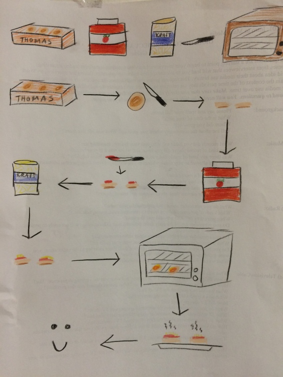
For this assignment, we were asked to create a visual guide of how to make English muffin pizza that would be easy enough for non-English speaking seven to twelve year olds to follow.  This proved to be just as difficult as it sounds as I was only able to use images, not words.  This was made even more difficult by the fact that I had never actually made English muffin pizza before.  Therefore, I had to find a recipe and research what it was.

I did not expect there to be so many recipes to make English muffin pizza.  In fact, I was quite baffled that there were several different recipes.  Some of them called for homemade tomato sauce, or called to shred the mozzarella cheese by hand.  I decided that since the visual guide is intended for seven to twelve year old children, I should use the simplest possible recipe I could find.  Something I thought was interesting was when I chose to use the toaster oven recipe over the oven recipe.  I figured that a seven year old would not be able to figure out how to preheat an oven and it is considerably dangerous for a seven year old to operate an oven by his or her self.

I started off my visual by writing down each step and then drawing a symbol for each step.  I then made a rough sketch of what I wanted my visual guide to look like.  After this, I grabbed my colored pencils and began my final draft.

In my visual guide, I thought it would be helpful for me to draw all the tools and ingredients needed at the top of the page.  From there I used drew each step using symbols and arrows to direct the person following the recipe.  I structured my guide in a “Candyland” approach mentioned in class because I felt it was easier to follow the recipe this way as it seemed to be a more natural way to read.  I chose minimal color.  I chose colors that I personally associated with each item.  I am not a strong artist.  Therefore, I chose to keep my symbols and images as simple as possible.

I did not have any particular revelations.  I was extremely excited, however, when I finally found a recipe I thought I could replicate easily.  It was fun to see all the different ways people have made English muffin pizza.

I think that if I had a little more time, I would have done this assignment in Photoshop as it would have looked neater and a little more aesthetically pleasing. If I had more talent I think I would have tried to make my symbols look nicer.  I also think my mozzarella cheesy symbol looks like mayonnaise, so, I probably would have spent more time making it look like cheese.  I think if I were to do this project again I would attempt to use a more challenging recipe and go into more detail.

Self Portraits

Screen Shot 2016-02-22 at 9.32.44 PM.pngScreen Shot 2016-02-22 at 10.03.27 PM.png

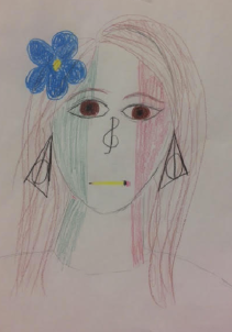
For this assignment I decided to use a selfie as my base picture.  After choosing my picture, I decided to draw a self portrait of myself while incorporating symbols I feel describe myself.  I started off with coloring my face as the Italian flag.  I am Italian through and through.  Both of my parents are Italian, and I speak Italian. My core concentration is Italian and I am actually traveling to Rome this summer.  I grew up experiencing Italian culture and family life.  It is the foundation of who I am, therefore, I decided to make it my symbolic foundation-my skin!  I then drew a cleft note in place of my nose.  I thought this was kind of clever because live and breathe music.  I would not be able to fully function if I did not have music in my life.  I have played piano for several years, taught myself guitar, sing, and composed music.  One of my favorite hobbies is playing or searching for new music.  I then decided to draw a pencil where my mouth is.  I decided to do this because I often express myself better in writing than I do verbally.  I am passionate about writing.  Part of the reason I am studying Communications is because I love writing and blogging.  I am able to understand and convey my thoughts and feelings better when I write, than anything else.  I am passionate about it.  I then decided to put the Deathly Hallows symbol (a symbol that appears in Harry Potter and the Deathly Hallows)  in place of my ears.  One of the first stories I remember my mother reading to me was Harry Potter. Listening to my mother read the series to me created not only an overly obsessed Harry Potter fanatic, but also an avid reader.  I love to read.  I feel placing this symbol where I did conveyed a fond memory, a franchise I am passionate about, and one of my favorite things to do.  Lastly, I placed a flower in my hair.  I love nature.  I also love spring and warm weather, which is normally when flowers are able to thrive.

The empirical representation of me is the selfie I took.  It offers no information about me, other than what my appearance is.  The symbolic portrait is a representation of me.  It shows what I love and what I am passionate about.  It offers information about me that only those close to me would be knowledgeable about.  It offers a deeper insight into who I am as a person, not just what I look like.  I think the signs that are more symbolic are the Italian flag, pencil, and the Harry Potter symbol.  The cleft note and the flower are more rational because they are easier to understand why I put them in the portrait.

This connects to the explanation realism and perspective we have learned in class.  In class we learned that realism is the realistic depiction of a subject.  The artist simply paints what they see, without any symbolism.  Perspective refers to the messages an individual can gain from the image.  I think the selfie is an example of realism, while the picture I drew is an example of perception because it is how I see myself.

Collage Part 2

image


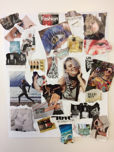
In this post I will be reflecting on my photo collage.  The photos from the collage were taken from three fashion magazines marketed largely towards women.  As I looked through each magazine I chose images that caught my eye or had powerful words. However, I did not particularly notice a pattern until I assembled the collage.  As I added more and more images, I started to notice a central theme of women.  I thought this was interesting, but not surprising considered the magazines I chose images from were largely meant for women.

Over the weekend, five classmates commented 3-5 patterns and a theme they observed in my collage.  The most common patterns observed were fashion, fitness, women, and feminism. The most commonly observed themes ranged from fashion, female image, and beauty.

After reviewing the patterns and themes observed by my classmates, I observed my collage.  Like my classmates, I also noticed patterns of fashion and women.  I ultimately decided that the theme of my collage was the female image.  I came to this conclusion because I found that I had a lot of interesting images that sent a powerful message based off of how women are portrayed in media.

Something that I thought was very interesting was the relationship between images and text I chose to use on the collage, and the placement of them on the collage.  For example, there is one image that says “love the body you’re with” next to “an image of a woman with strong arms with the caption “get strong sexy arms.”  These two statements totally contradict each other!  This is made even more powerful when combined with an image of a woman with an imperfect body.  How can a woman love the body she is given when she sees advertisements telling her how to change and improve a part of her body.  This is made even more powerful considering the collage is comprised of images of women and images of products that are designed to make women beautiful.  These products such as lipstick, eye shadow, perfume, and nail polish are designed to make imperfect women, perfect.  If magazines are always trying to improve women, how can a woman believe that she is perfect the way she is?

I also noticed the poses women are photographed in.  It seems somewhat stereotypical.  Next to the words “we like girls who talk back” there is a photograph of a woman with purple hair. That quote made me wonder…who is “we?”  I noticed for the most part, women were portrayed as happy or posed provocatively.  I would also like to call attention to the image of the woman taking a selfie.  Do we ever see men in magazines taking selfies?  I just thought this was interesting.  This was my Aha! moment.  At first, I looked at the collage as a whole.  Then, once I gathered my central theme, I started to notice little parts that each had a different message when grouped together.  This connected to what we learned in class because it taught me to think and interpret my images more abstractedly.  A picture of a woman is not just an image of a woman.  Not every image we see is black and white.  It can be interpreted in a different way every single time you look at it.

I thoroughly enjoyed this assignment.  I did not really come in contact with any problems.  If I had more time, I would have added more images and perhaps used and even larger piece of paper.


Spectatorship and Power Relationships in Advertising

drew-barrymore-covergirl-trublend-0911.jpgcalvin-klein-eternity-2014-fragrance-christy-turlington.jpg

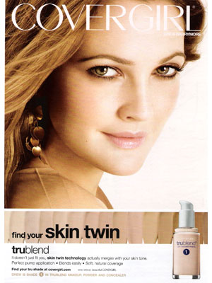
I chose cosmetic and perfume advertisements for the two advertisements I plan to compare.  The first one is a Covergirl advertisement featuring Drew Barrymore.  My second advertisement is for the Calvin Klein perfume “Eternity,” featuring two models.  For the Covergirl Advertisement, it is pretty obvious that Drew Barrymore knows she is the subject of the photograph.  She is looking right into the lense of the camera and into the spectators and slightly smiling.  The spectator, of course, being the audience, viewer, or consumer of the product.  The advertisement says “find your skin twin.”  This is important considering the advertisement aims to market a new foundation.  When it comes to shopping for a foundation, most women would like the foundation to be the same shade and tone as their natural skin.  The words, paired with natural and nude colors, makes the advertisement effective.  The nude tones are relaxing to the eye.  This pairs excellently with the picture of Drew Barrymore.  She is featured with glowing, perfect skin and very natural but pretty makeup.  She has a girl-next-door look in the ad.   The size of her image in the photograph makes her the focal point, inevitably giving and making her a powerful presence.  Ultimately, the ad suggests that if you use this foundation, not only will it totally match your natural skin tone, but it will also give you the natural, pretty, and flirtatious look of Drew Barrymore.  This directly correlates with gaze.  Gaze refers to how an image or text can convey or invite a certain response.  The image invites spectators to believe that if they use the product they can be pretty, have beautiful skin, and exude confidence.

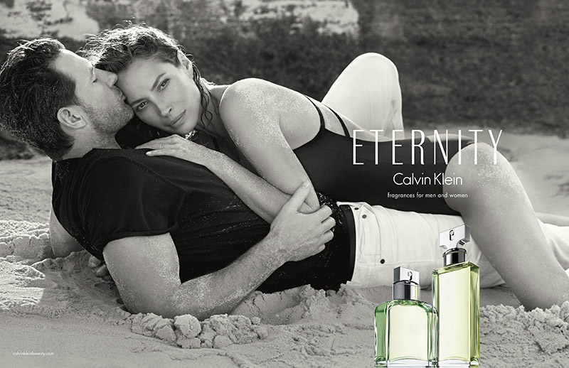
The second advertisement is for Calvin Klein’s “Eternity” perfume for men and women.  In this advertisement, two models, one male and one female, are the subject.  The models are featured in a black and white photograph on a beach, laying on top of each other.  The female model knows she is the subject of the advertisement.  She is looking contentedly into the camera.  However, the male model does not know he is the subject of the advertisement as his face is turned away as he kisses the female model on the forehead.  This gives the woman photographed more power in the image, inevitably making her the stronger figure.  One interesting thing about the ad is the use of black and white.  I feel it almost takes some of the attention away from the models due to the fact that the product is placed in front of the models in the picture and has a bright green color.  Similar to the Covergirl advertisement, the image directly correlates with Gaze as it invites a certain response from the spectator.  The response conveyed is that if you use the perfume, you can be beautiful, sexy, and powerful and that men or women will want to be with you.

One thing that I learned from the assignment is how the definition of Gaze can be applied to real world situations, more specifically, advertising.  It gave me a better understanding of the term we studied in Sturken and Cartwright’s “Practice of Looking.”  Ultimately both advertisements are marketing towards a certain consumer and are aiming to convey or invite a certain idea or response.  I think the thinker that best goes with this assignment is Barthes as he firmly believed that everyone takes away their own meaning from a presented image or idea.

Appropriation in Pop Culture

One-Direction-Beatles.jpg

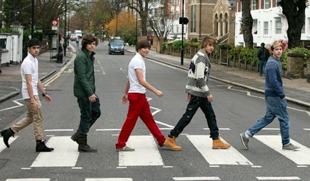
Appropriation in popular culture refers to taking one idea and using it to create something new. It changes the meaning of the original work.  This image is an example of appropriation.  This image depicts the members of the British boy band, One Direction recreating the cover of the Beatles’ famous “Abbey Road” cover.

The reason this is pop culture appropriation is because it changes the meaning of the iconic original photo.  Prior to this image, when people viewed the “Abbey Road” cover, they were reminded of how influential the Beatles and their music was.  One Direction uses this image to create the idea that they are as great as The Beatles were, and are just as influential to music.  This, however is untrue considering how the Beatles changed and were iconic in rock music.  One Direction, unfortunately appeals to the demographic of young girls around the age of 12.  Additionally, One Direction is not as influential to music in the way the Beatles were.  One Direction is not made up of talented songwriters and musicians.  It is made up of young men who sing well together, who can dance and are considered attractive.  However, it does give the group more attention, which is most likely what they were aiming to do by taking the image.

The image is upsetting.  While it is not blatantly racist or offensive, it is disrespectful.  It is upsetting because it disrespects the Beatles and discredits their influence over music.  It caused criticism, backlash, and generated several memes that expressed anger an annoyance over the image. It might not be disrespectful to a culture, but it is disrespectful to true talent with an influence over history.  Not to offend One Direction, but it is doubtful they will continue to be relevant 50 years from now the way the Beatles were.

I learned about appropriation through this assignment. I learned how appropriation includes the manipulation of one work or idea in order to create new meaning or a new idea.  I learned that it is extremely prominent in pop culture.  Appropriation is everywhere.  It is in commercials, music videos, social media, music, television, movies, the internet, and advertisements.  Appropriation can also be cultural and can even be considered offensive.  Ultimately, the assignment has forced me to be more observant about appropriation in popular culture.  It is important that the original meaning of the idea is referenced.  Anyone can walk across Abbey Road and take a picture.  However it’s the fact that One Direction copied the Beatles and used it as an album cover that makes it appropriation.  It should also be pointed out that not all appropriation should be considered offensive.  Some appropriation can be used to make a statement about society or politics.  It is all about how one approaches and presents their idea.  This image is an example of cultural appropriation because music is a part of culture, as well as history.  This assignment has ultimately made me much more well informed about appropriation in popular culture.


Five Photos

IMG_2265.jpg

COLOR

My first image focuses on color.  This is a picture from the ice castle spectacular in New Hampshire.  I zoomed in on the image so the color would be more vibrant.  The image itself is a man made ice mound carved into a castle-like structure with lights wired through the ice.  I thought this picture was an interesting way to portray color because the texture and carvings in the ice, and the way the lights are wired through the ice create an ombre effect.  It looks like a piece of art, almost like a water color painting.

Screen Shot 2016-02-08 at 3.21.08 PM.png

RELATIVE SIZE

My next image is of the Breakers in Newport.  The mansion is HUGE!  I felt that shooting the image head on did not give the size  of the mansion justice.  So, I decided to walk a distance from the mansion and instead of taking the picture at a long or medium shot, I decided to take it at a low angle shot with the camera pointed up.  By doing this I successfully made the mansion seem even larger than it actually is, ultimately conveying, if not exaggerating, how grand the mansion is in person.

Screen Shot 2016-02-08 at 3.24.49 PM.png

LINE

This is an image taken of a pier in Bristol, Rhode Island.  I thought the depth of the lines in the image were interesting and added a substantial amount of texture.  I zoomed in on the image in order to capture the grooves in the wood.  I took the picture at a high angle shot because I liked the way it created movement with the liens.  This is one of my favorite images.  I like this image also because of the perpendicular lines between the floor and the fence create shadows. Interestingly enough, despite the picture looking like it was shot in black and white, it actually has no filter on it at all.  The angle I shot the image with interacted with the sun, creating this effect.

Screen Shot 2016-02-08 at 3.21.44 PM.png

SHAPE

This photo was taken in Newport as well.  I thought the shape of the bricks looked interesting with the shadows of leaves and the ornaments.  I also liked how in the image the bricks look crooked and distorted.  They look like they are falling apart.  I also like the how the ornament and leaves stick out from the image.  Everything looks like you could reach out and touch the objects in the photograph. I think this is because of the way the light creates shadows, making the image more life-like.

Screen Shot 2016-02-08 at 3.22.15 PM.png


STRUCTURE

This final image is an example of structure.  The structure is an example of real life art.  But, if you really look at it, the structure itself is very clever. It is very fluid and graceful looking. It also is divided into unique pieces like a puzzle.  Each part or section of the structure allows you to see a different view.  It allows someone to see every part outside of the structure from a different perspective.  This is quite interesting because it not only is a piece of art itself, but also forces viewers to take in different perspectives created by the art itself.

Through this post, I was attempting to convey an understanding of sensory within photographs.  I wanted to use images I’d taken that I was very fond of and see how they met this criteria.  One of the problems I encountered was that I had trouble choosing between pictures.  I did not particularly have an AHA! moment during this project.  If I had more time and resources, instead of using my phone, I would have used my Nikon camera.


Icons in Our Society

spotify-ad-2.jpg

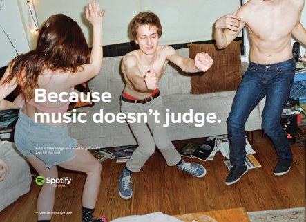
This is an advertisement for Spotify.  The image icon is the three people dancing without their shirts on.  The universal concepts, emotions, and meanings the the image icons promote is fun.  It promotes the idea that if one uses Spotify to stream music, they can have a fun and wild party with their friends.  They can be carefree and wild too.

The advertiser connects this to the product being sold because Spotify is a music streaming service.  It connects to the picture because at parties, music is essential.  It sets the tone for the party.  Music affects how people feel and allows them to let loose.  Therefore, the better the music, the better the party, therefore, the happier the people.  Spotify aids in this process and allows users to create the perfect party atmosphere with ease.  Simply turn on your computer and choose a playlist.  There is no need to purchase music and download them to an mp3 player or ipod/iphone.  The slogan “because music doesn’t judge” cements the idea into place as well because it reminds consumers the importance of music and how people can lose themselves in it.

The advertisement does persuade me to use Spotify.  It persuades me because I am an avid music lover and therefore, any music streaming service intrigues me.  However, the advertisement doesn’t exactly explain what the product is or what it does.  If someone with no prior knowledge about Spotify looked at the advertisement they would think the product had something to do with music…but not much else.  It does not tell consumers that you can stream it from your phone or computer, or that it allows you to follow playlists and save music to a library.  It does not tell you that users can share playlists they make with friends on Facebook.  This is all crucial information for those who are interested in building and creating a music library or are interested in finding new music. The single idea it promotes is that music allows people to have carefree fun.  That’s all well and good, but it is not a very effective advertisement for the demographic of consumers that do not party.

The thinker that best fits this assignment is Peirce.  Peirce believed that a sign consists of a signifying element and an interpretant.  In this image the sign is the image and the interpretant is the consumer. When applied to the Spotify advertisement, the signifying element is the image of the people going nuts at a party paired with the slogan, and the interpretant is the consumer.  As a consumer, I gathered that if one uses Spotify they can be carefree and have fun.

This relates to what we studied in class because we are studying photographic truth, and how it is a myth.  Images are simply images.  Viewers of the image can interpret it any way they see fit.  However, images can also be created to manipulate people to think in a certain way as well.

What I learned from this assignment was the difference between how a product is marketed towards consumers versus what the product actually does.  This was very interesting to me because if I had no previous knowledge of Spotify, after viewing the advertisement, I would not be impressed.