This is my test blog for Comm 380
Author: krispoli849
I am a sophomore at Roger Williams University. I am a Communication and Media Studies major with a Professional and Public Writing minor.
Final Project

Rough Draft
Final
Design Rationale:
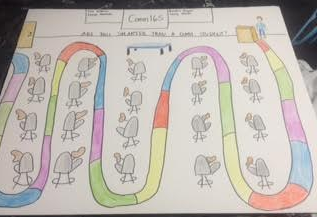
The most challenging aspect of creating this game was coming up with the idea to begin with. Our first instinct was to create a giant flowchart outlining the ins and outs of COMM 165; however, a flowchart is not a 3-dimensional visual. In order to solve this problem, we brainstormed ideas of how to incorporate all the information we wanted to put in the flow chart into a 3-dimensional and interactive visual. When we met as a group, we asked each group member to come with a sketch of an idea, & we combined elements from each person’s sketch in order to create the final product. That being said, we used an extensive creative process when creating the visual representation of what we’ve learned this semester in Visual Communication. We decided that the most fun and best way to represent our knowledge was to create a game. The game is called “Are You Smarter Than a Comm Student?” To start the design of the game, we decided to brainstorm a list of topics we had learned about throughout the semester. This included vocabulary, flowcharts, tables, graphs, mind-maps, color, the Gestalt principles, charts, and maps. We sorted these topics into different categories so we could create trivia questions based on each grouping; we consequently color-coded the game board according to those categories. For example, we have five groups: Miscellaneous (blue), symbols (yellow), flowcharts (orange), vocabulary (purple), and true/false (green). Each space on the game board is colored in correspondence with one of these categories; in terms of visual processing, color-coding allows viewers to more clearly perceive connections between the two elements of our game. Even if we had not specified that the colors on the index cards correspond to the colors on the game board in the game rules, players would most likely be able to figure it out because the colors match up. This was our “aha” moment; we realized how powerful the pattern-seeking brain can truly be. The brain subconsciously finds patterns/similarities.
We designed the game board to look like a map of the classroom since maps are one of the types of visualizations we studied this semester. That being said, the game players move from the starting point (Dr. O’Connell standing at the podium) to the end-point (the classroom door). By doing this, we attempted to incorporate a metaphor; at the beginning of the semester, we entered the class not knowing much about visual communication. In other words, we needed Dr. O’Connell to educate us about the topic. As the semester moves forward, the game allows the players to move farther and farther away from Dr. O’Connell and the podium as long as they are able to demonstrate considerable knowledge about visual communication by answering the trivia questions correctly. The players that are able to show their knowledge move through the game (and metaphorically, the semester) and end up the classroom door, symbolizing that they have learned all that the course has to offer and are therefore ready to leave the classroom. In other words, the map is designed to get players from the podium to the door. On that note, the map includes “landmarks” of the classroom in order to guide the reader through the class. For example, the whiteboard, table, and overhead projector are positioned at the front of the classroom as they are in reality. We included the new and improved desks that we began using this semester and designed everything to look as realistic as possible.
Personal Reflection:
I thoroughly enjoyed working on this project. This is actually the first group project in my college career that was able to be completed with ease. My group members and I worked extremely well together. We were able to communicate effectively and work efficiently. Our largest challenge was formulating and idea that would visually represent everything we learned in the class. As we reviewed, I was reminded of several concepts from earlier in the semester that I had forgotten about. It is interesting that a concept that seemed so foreign to me when it was first introduced to me, seemed like common knowledge and sense now that I have completed the this course. Even though I had forgotten about the concept, I was still able to recall it’s importance because of how it was connected to several other aspects and concepts we learned about in the class.
We ultimately were trying to do by completing this project was to create a fun, engaging way, to not only teach communication students about the concepts, theories, and vocabulary learned throughout the course, but also to make those playing the game actually identify why an answer is right or wrong. By having this understanding of why an answer is right or wrong, I feel the person playing will have a better understanding of the information being presented. I also think that considering it is finals week we wanted to create a fun way to review for a course that did not involve note cards or staring at notes. I think that while we also created a visual representation of Visual Communication, we also created a new and highly effective way to review material for a test.
This assignment related to everything we have learned over the course of the semester. We related every aspect of our game back to an aspect of the classroom, whether it be through our knowledge of color when color coding the game, creating a map of the classroom for our board-game, or by using knowledge Occam’s Razor and only acknowledging the important landmarks of the classroom to create our board-game, instead of using too much detail and information in order to decrease cognitive load.
My AHA! moment in this project was that we were using information and skills developed in class to complete this project without even knowing it. I thought this was really interesting. For example, when color coding spots on the board with topics of questions on the cards, I simply thought we were doing this to make the game more simple. However after thinking about it a little more, I realize we were using our knowledge of a pattern seeking brain when we did this.
If I had more resources, I would have used marker on the board-game to make the colors more vibrant. I also would have had the playing cards laminated in order to make them look more professional instead of coloring on index cards. I think we also could have added some more intricate rules and made game pieces for people to use.
Iconography
This is the Starbucks symbol. This relates to the concept of iconography, cultural appropriation, and global flows. Iconography refers to an interpretation or visual images or symbols. An icon is a representative symbol of a person, place, or thing. By this definition, the Starbucks symbol is the perfect example of an icon. Starbucks started as a small local coffee shop in Seattle, Washington in the early 1970s. Starbucks became known for their coffee flavors and creations. As Starbucks’ popularity grew, so did the popularity of the interesting symbol on their cups. When Starbucks became a chain establishment, the symbol on the cups became the representation for Starbucks. Now, Starbucks is a world wide known company. There are Starbucks establishments all over the world, from the United States, to Europe, to Asia. No matter where you are in the world, if you see the symbol on the cup of the building, you know it’s Starbucks. Starbucks has taken advantage of this. Starbucks often offers holiday cups or limited time cups with a new design as an advertising strategy. As long as they have the emblem, regardless of the change in cup design or color, everyone will still know they are going into or getting Starbucks. This is important considering Starbucks are found all over the world. This solves the issue of a language or cultural barrier. If an American is traveling in Italy, or China, as long as they see the symbol, they will know they are walking into a Starbucks.
The use of the symbol has been positive in the United States, However, the image on the symbol is often criticized as objectifying towards women. The symbol portrays a nude mermaid. Many find this offensive and objectifying to women because nudity it being used to represent and advertise a product. Why does she have to be nude? If the symbol has to be nude, why can it not be a man? Starbucks has been under scrutiny several times for the actual image. It has evolved several times over the past 40 or so years and still receives criticism. However, it is so iconic that if Starbucks were to change the symbol now, Starbucks would probably see a decrease in sales all over the world. Personally, as a female, I do not have an issue with the cup, because at the end of the day…it’s a cup holding a cup of coffee. I think that something that would be more culturally accepted in the United States would either glorify American values, or would be more central to the birthplace of Starbucks.
Arjun Appadurai is most closely related to this assignment. His view of culture activity and specialization in globalization included ethnoscapes, mediascapes, ideoscapes, and technoscapes. This fits the assignment because he explained these ideas and related it back to iconography.
In this assignment, I learned more about iconography. I also learned about how places or things that are iconic in the United States use symbols to expand their popularity across cultures.
Sketchbook
This post will review and illustrate my progression in my skills as a visual communicator. This is a post to my instructor as a way to review my end of the semester work.
At the beginning of the semester we were all asked to purchase a sketchbook. While originally, I hesitated, reluctant to spend money I don’t have on something that I did not think I’d use very often, after the first few assignments I decided to bite the bullet and comply. I chose the cheapest one I could find on Amazon. I was a little disappointed however when my sketchbook arrived and had “Anna’s Sketch Pad”printed on EVERY SINGLE PAGE. I was so irritated! Nevertheless, I decided to continue to use the sketchbook. I found throughout the semester that I would often forget my sketchbook and would draft ideas on a piece of lined paper, or printer paper. This was often unsuccessful as I would often lose the papers, forcing me to redraw or print the picture I took of the draft and place it in my sketchbook. I eventually learned to bring my sketchbook with me when I planned to do my Visual Comm homework.
I used the sketchbook in the same way I draft an essay; as an outline. I noticed as I went through my sketchbook that my drafts were sparse. Similar to an outline of an essay, I often deviated from my original ideas, which in the long run was both good and bad. I was frustrated looking at my drafts for the most part because they did not really introduce my thought process. They introduced my idea and a possible plan, but with the exception of the “”story boarding” assignment, and any of the “tables and graphs” posts, I could not for the life of me recall what I had been thinking. I think I simply used the drafts as a way to list or come up with ideas. When I found an idea I liked I simply stopped drafting and went straight to making the final product. I think this is really stupid in hindsight, but I guess at one point I thought this worked.
I noticed a progression with my mind-maps. They became more elaborate, organized, and detailed, which is something I was hoping I would see because mind-mapping has become a huge part of my academic career. I use it as a way to organize my thoughts and ideas not just in visual communication, but in other classes as well.
As I annotated my sketchbook I thought it would be helpful to print out drafts I had lost but still posted to my blog, or to print out the final product. I liked seeing my progression from awful draft to slightly better draft, (sometimes) to final product. I think I noted in my annotations that I liked certain ideas, or wished I had done something differently. I noted what I would have done differently as well.
I think my favorite blog assignment was the resume. Also, I think my AHA! moment in this assignment was when I was looking at each stage of each assignment.

Brain / Pharma Ads
The brain simulations were quite interesting. It was very interesting to review the different parts of the brain. However, it did not particularly persuade me to change how I live my life in order to have better functioning. It is important to me to exercise regularly, eat healthy, and sleep a healthy amount (even though this might not always happen). I do not use drugs and my alcoholic intake is extremely low. I always make sure I am not glued to my television or phone (unless I’m texting someone or calling someone). I read a significant amount simply for pleasure and I believe this gives me a healthy brain functioning.
I enjoyed the healthline.com site. I enjoyed it because when you click on a part of the brain, it gives you a summary of what that part does for the brain and body function. I thought this was extremely interesting. I did not enjoy the other site as much because it did not explain the parts of the brain or what the did. It was like looking at an image without receiving any context. The image would have been more powerful if it offered an explanation. Without the explanation it was boring and seemed somewhat pointless. I learned more from the other site, which was something I really appreciated. However, while it was informative, it was still not persuasive enough to make me want to change my lifestyle. In order or it to be persuasive, it would have had to tell me how to improve my brain function and what harms brain function. I do not really understand a much more than I did before. I would not say that this would go along with the idea of “the truth made visible.”
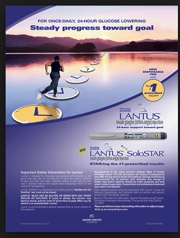
Pharmaceutical companies advertise their medications through Direct to Consumer Pharmaceutical Advertisements. This is an ad for Lantus. Lantus is a drug for diabetics looking to better manage their diabetes. It depicts a person runniny on top of clocks balanced on a lake. This advertisement does not have a checklist of symptoms that interpellates the viewer. The side effects include tremors, headaches, low blood sugar, trouble concentrating, and seizures. Considering there was not checklist of symptoms, one would not know if the list of side effects is longer than the list of symptoms the drug treats. Overall, the drug promises to help treat diabetes.
This assignment relates to the idea of mediascape. Mediascape refers to the way visual imagery impacts the world.
From this assignment I have a better understanding of how medicines and drugs are advertised to consumers. I think it is interesting that in this particular ad, the image has nothing to do with diabetes. I think it is interesting how the advertisements emphasize certain words such as the list of symptoms the drug treats, or what the drug is supposed to do. The ads almost seem to hide the parts of the ad that would turn the consumer away from the product.
Image
Visual Resume


This is my visual resume. The topi image is a rough draft. I drafted this assignment a couple of times before I was able to decide the story I wanted to tell. The image at the top left is a mind map. The mind map is basically a summary of the important aspects of my resume. I focused on my past two work study positions in the University Advising Center, and at the Roger Williams Athletic Department. In each one I focused on what the job entailed and what skills I earned while working there. I also focused on my summer job as an office and financial assistant at a local bus company in my town. I also specified the skills I earned there. Considering my resume is in a state of transition, instead of focusing on an internship and a small job I had in high school, I focused on the first huge internship I landed in college. I am starting in June and specified my job description.
I then took these ideas from the mind map and made a timeline of where I worked ad when. I tried to show the time between each place I’ve worked at in reference to the 2014, 2015, and 2016 markers. The table in the middle describes each place I’ve worked at, some of the skills I’ve gained from working there, and how long I worked there out of my 25 month long working life.
The bar graph describes the amount of time out of 25 months that I have practiced each skill. For example, since I have had 2 separate jobs that have given me phone skills, I combined the amount of time I worked at both places to be the total amount of time that I have worked on each skill. I thought this was interesting though not surprising that I have I am seemingly most skilled in email and phone etiquette. The pie graph tells me the percentage of my working life I have spent working at each place.
I had a lot of trouble with this assignment. I had trouble because my entire resume is about to change considering a future interview at a new work study position, a new summer internship, and yet another summer being spent at my typical summer job. I need to decide how to rework my resume. This was a good starting point. I was quite surprised that Tag was not a larger percentage as it feels as though I spend most of my life there.
I like the final product I created. I think it tells a unique story about my employment history. However, it does not convey everything about my resume such as my major, school, language skills, computer skills, or social media skills. I think if I were to do this again I would make charts about my skills or an infographic about my skills. However, starting this assignment with the mind map has helped me gather my thoughts immensely. This assignment has made me feel more organized for when I edit my resume.
Poster Session

This is the last poster session I attended. This poster presents research on the Lotka-Volterra Predator-Prey Model and Solution. The presenters were Erin Barbee, Dave Cartwright, and Samantha Siebert. This data was collected for a math class (I’m cannot recall what the name of the class was called).
The group was presenting in GHH during a very crowded poster session time. Therefore, their audience was a mixed group of people with different level of knowledge about their topic. One issue I noted they had is that they had trouble garnering attention of others. Also, I noted that as they presented they would lose their audience. This is challenging to present information with confidence. I noticed that as this continued to happen, the group seemed to not really care any more about presenting their data.
Their learning objective was to study, analyze, and be able to inform others about this specific model and its solution. I honestly did not understand what they were saying. While I understand that it is hard to present in an extremely crowded room, to people you do not know, it would have been a more engaging presentation if they had explained their data and reasoning in a more in depth way .
Something I did not realize right away was that there were three people in the group presenting. I had originally thought it was only the two girls pictured above. However, only when I finish taking the picture that there was another group member. It took me a while to realize that the guy standing near them, but not saying anything was part of their group.
I like their poster. Their poster was my favorite out of all the posters I’d seen. It was the easiest to read and most aesthetically pleasing. They separated their poster into an introduction, methods, calculations, applications, drawbacks and reference section. Something I thought set their poster apart from others is that they were the only group who explained how the formulas they used applied to their experiment and either enhanced or took away from their data. While I may not have understood any of what they said, I did appreciate that they explained how and why the formulas and calculations mattered.
Their poster was easy to read. The spacing was excellent. Nothing was too far apart or too close together. Successfully creating flowing spatial relationships between sections or images or words can be challenging. Their graphics were visible and a good size. I also really liked the color of their poster. It was professional poster, but still cute and set it apart from other posters.
Overall, I liked their poster but did not like their presentation. Their presentation felt awkward and was hard to follow. In the past posts I summarized the data each presenter explained. However, I felt so lost in this presentation that I do not think I could accurately regurgitate the information and explain what they explained. I will not fully blame this on the presenters as it was quite loud in GHH.
Poster Session 265

To start off this assignment, I must apologize for the awful lighting in this picture. This was taken in GHH where windows are quite abundant and sunlight is fierce. This is the poster of Michaella Petrucci. This is her business plan and model for her business enterprise class. All business majors are required to take this class and in order to pass the course, students must come up with their own innovative business.
Michaella’s business plan is for an ice cream shop. She explained that the ice cream shop will be different than others because unlike your traditional ice cream shop, hers will be technologically advanced. What sets this ice cream shop apart is that when someone goes to order their ice cream, they submit their order on an iPad. They can select their flavor, toppings, and size of their ice cream. Also instead of the price being based off of the amount of toppings like most stores, there is one fixed price based off of the size of the order.
Michaella’s rhetorical situation was to explain her business model and why it would be successful to people who would normally not have any background knowledge about creating a business. However, considering the massive audience attending the poster sessions I would argue that everyone that listened to her presentation had a different background in their knowledge of business and creating a business. I also must note that there were several presentations going on at this time and therefore, it is hard to focus or gain an audience. Considering I am not a business major, minor, or core concentration, I do not have a business background. I understand business as much as the next person. Therefore, watching her presentation was very informative and I learned a lot. Overall, her presentation was good. She was clear and explicit and organized with her explanation of her research and her idea. It was very easy to follow her plan.
Her learning objective was to have a better understanding of business, how business works, and how to start a business. She said she had a considerable amount of trouble trying to iron out all the little, yet important details of her business model. She said there are so many factors to consider when creating a business from scratch.
Something that could have been better was the organization of her poster. I found it hard to follow the information on the poster as she spoke. I think there was a lot going on at once. I think she should have considered better spacing options between the sections on her poster. I also think she could have done a nicer job with cutting the paper so that it had straight edges. I think it would have looked more organized. Lastly, Michaella, while extremely well informed on the subject of her presentation, did not present with confidence. She was extremely shy and not sure of what to say. However, I will say that I would not be able to stand up in front of strangers and talk about my business plan. Overall, she did extremely well.
Poster Session

This is the second presenter I observed at the poster session. This is Keegan Heston’s poster for Human Behavior. Keegan presented his information about the effect of the refugee crisis on the quality of life of refugees. I thought the topic of his presentation was EXTREMELY interesting. The reason I enjoyed his topic so much is because it is always in the news. The refugee crisis is something I am extremely interested in. The topic is everywhere, even in the political debates.
Keegan also had an interesting rhetorical situation. He presented his information in a loud, crowded room with several other presenters. He is audience was those attending the presentations at the poster session. However, it is arguable that considering the context in which he created his poster, he had a better chance for his audience to understand his topic. He did his poster for Human Behavior. Human Behavior is a required class at Roger Williams. Therefore, considering people’s familiarity with the class (even if they have not taken it) he probably had an easier time conveying his objective.
His poster was separated into five parts; inspiration, background, lives forever altered, and works cited. I thought this was very organized. As Keegan explained that the due to the refugee crisis, refugees have a lower quality of life, the poster was very helpful as a reference. The poster was organized in a way that made him easy to follow. He was extremely well informed about his topic. He explained that constant uncertainty is the basis the lives or refugees. Refugees are forced to live a life of fear of persecution and death. Their lives are altered drastically.
Keegan was extremely well informed about his topic. He presented his ideas clearly and concisely. He spoke with confidence and with ease. His objective was to inform his listeners about the refugee crisis and to help them realize the perils a refugee faces on a daily basis.
I found his presentation to be extremely interesting. It was both a review of information I already knew, but also presented new information that I had not previously known before.
I did not like Keegan’s poster. I do not think it had enough information on it. Considering that he used the poster to guide his presentation rather than it being the focal point of his presentation, this is actually fine. But, it is harder for a passerby who just wants to read the information quickly, rather than listen to a whole presentation. I also thought his poster was too busy. His font was too dark for the background of his poster and made it hard to read. Or, the image was too dark and needed to be lighter. Either way, the poster was extremely difficult to read. I found myself extremely frustrated that I had to squint at the information. While I thought the image itself was a nice touch, it needed to be edited in a way that made it easier for the audience to read the information.
Keegan said he did not have any issues creating and collecting his data
Poster Session

I was foolish to forget to write this young woman’s name down. However, she was the first person I spoke to about at the poster session and mistakes are going to be made. She is a Psychology student. Her presentation was about the gap between genders and employment. Are men considered for certain jobs over women? Are women stereotyped into certain jobs? All of this was explained in her lovely presentation.
The rhetorical situation of her presentation played a massive role in her overall performance and presentation of her research. She was presenting in a poster session. There are several other students also presenting posters on a variety of topics in close quarters with her. Additionally, she was presenting to an audience that had mixed views and knowledge of the information she is presenting. Some people may have had some background or understanding on her research, formulas, and ideas, while others may have never heard of it. Therefore, her purpose was to convey her ideas in a concise, easy to understand manner that did not overwhelm or bore her listeners.
Her poster was separated into different parts; background, objectives / hypothesis, participants / procedures, research design, measures, results, conclusions, and references. She presented information about how men’s resumes are given hierarchy over women’s and are given priority over others. She continued on by explaining that resumes that were considered superior to others by employers were more likely to be hired. Therefore, men are more likely to be hired for a position than women
I thoroughly enjoyed speaking with this student. I am extremely interested in psychology and considering my full and demanding course load I have not been able to take any psychology classes. Additionally, I have a strong interests in female and male opportunity in the workforce. As a female that is going to be soon entering an extremely competitive job market, I would love to be more informed on what I will be competing with. Therefore, I found her research about how men are considered for certain jobs over women interesting especially considering gender pay gap is also still a relevant issue women face today in the workforce.
Overall, her presentation was really nice. She was friendly and explained everything in detail. However, something that was confusing was that she did not explain all of her research. She started off her presentation by explaining that she and her group wanted to study if women were put into more stereotypical jobs. However, she never explained her research about this aspect of the presentation or her conclusions about it. She also used several formulas to draw conclusions from her research, but did not explain it. While I understand that formulas are hard to explain in detail, I would have liked a summary of what each formula was supposed to tell her. She also did not explain how she conducted her research.
Her poster was very organized. However, it was somewhat boring to look at. It had no color and did not draw the viewer’s eye to the information. There was no emphasis on important information, and the only visual was the formula’s and graphs. She noted that she had a lot of issues compiling her data as it was rather time consuming.
